Cal Poly Health and Wellbeing
Role
Web UX Designer at Cal Poly Health
and Wellbeing
tools
Figma, Adobe Illustrator, Google Analytics
Project description
I worked on both the Health Services pages as well as the STI Campaign pages as two of my largest projects these past few quarters.
Website is ugly!!!!
The Cal Poly Health & Wellbeing department staff had been getting student and parent feedback for months about the website not having a clear information search and retrieval process, which was hindering their ability to complete tasks and find information on time. Knowing that the staff themselves didn't have the expertise to complete this task, I was hired through two rounds of interviewing to take on the job of making the website more user friendly (:
Why are students struggling?
I partnered with Pulse, a student-run health education program, to conduct a 3-day survey on campus
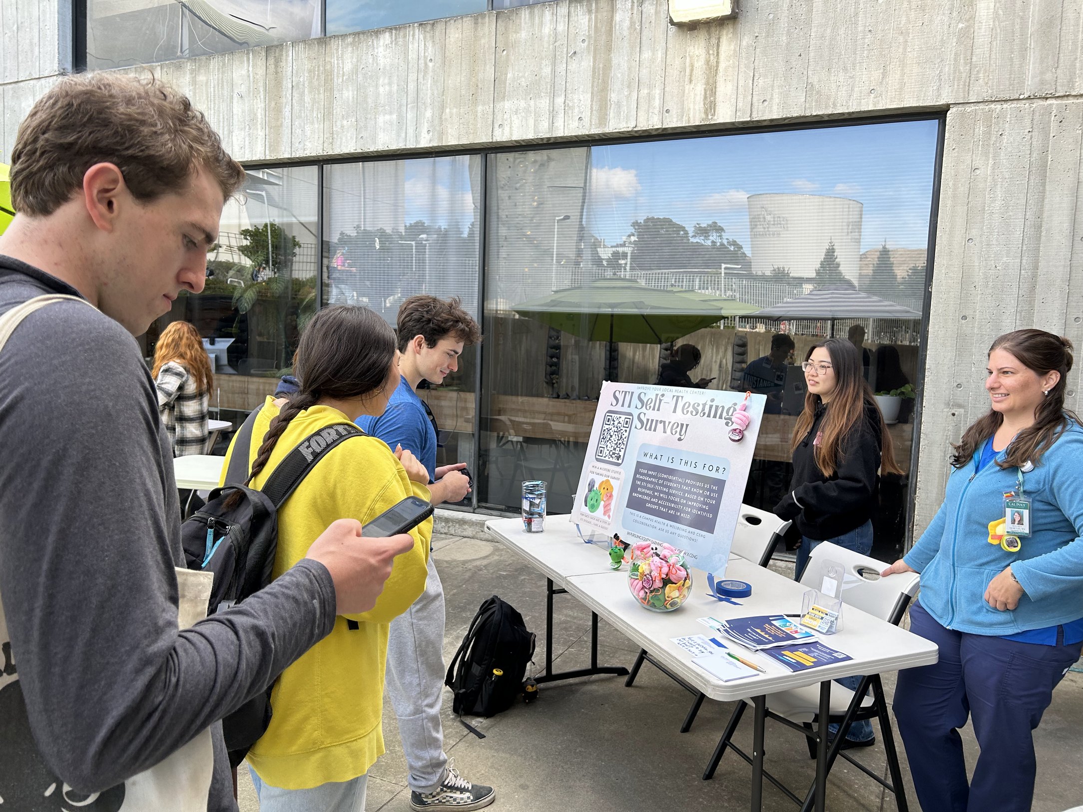
Out of 218 participants...
.png)
01 Lack of visual hierarchy + buried info
02 Informational overload + excessive steps
HMW...
design an intuitive and accessible information search experience for Cal Poly students
With input from stakeholders — Medical directors, CH&W staff, and Health Education team — we converged on key goals.
- 1. Improve the scannability of the website, allowing users to quickly identify key information and navigate to relevant sections.
- 2. Instill trust and credibility.
- 3. Create a familiar and cohesive experience for users.
- 4. Optimized information retrieval.
Using UXR findings + collaboration efforts, I established
non-negotiable design elements.
- 1. Icons/graphics to represent different topics in lieu of heavy text
- 2. Maintain visual brand consistency across graphical elements
- 3. Similar page headings across all pages
- 4. Array of page icons on the landing page

.png)

For the wireframe of the Health Services home page, as shown on the right, I discussed the layout of various icons with the collaborators.
Should we focus on symmetry?
Should we only have the necessary number of icons?
I worked with mainly the Health Education team to create plain language copy suitable for college students
I started off with working in Notion to create a simple layout and then moved into Microsoft word to finalize all the copy.


Adaptability is always necessary for design projects
When working with multiple groups of stakeholders, I had to learn that it's okay to have to juggle differences of opinions, and that I need to find a balance between what's wanted + needed by non-users & users.
Coming into the job, I was told to learn the ins and outs of Drupal 7, a 2011 website software. As I dived deeper into designing the website, I quickly learned that there's a myriad of kinks in the website. From not being able to customize text styles and layouts to being confined to one preset design theme, I had to learn how to work around these issues; Figma and Adobe Illustrator became my best friends.
I'm
excited for the next few quarters of this job
😊With the Health Services pages and the STI Campaign pages as largest two projects I've had so far, the smaller pages also reached my scope. Whether it's pages within Health Services or a few other pages within the other departments of Cal Poly Health & Wellbeing, I've had to create pages using their appropriate branding + audience.
.png)


